DAQRI’s AR Design System combines theory, resources, and tools for crafting highly functional, consistent and intuitive AR experiences.
The following points where the initial motivation to invest into a company wide design system but it soon became a fundamental way of thinking that enabled us to design and build a large number of Industrial Grade UI components that are being used by workers across a wide range of industries every day.
• Save Time - Reusable UI assets reduce time and efforts during asset creation, exporting and implementation.
• UI Consistency - The DAQRI Design System defines a unified style across applications and enables a consistent user experience.
• Global Styles - The Theme Manager offers a single place to define a global Style.
• More Performant - Because shared Textures/Sprites are more performant in the memory.
• Recreatable Designs - The AR Design System enables designers to be creative within a framework that is recreatable by the developer.Hands Free
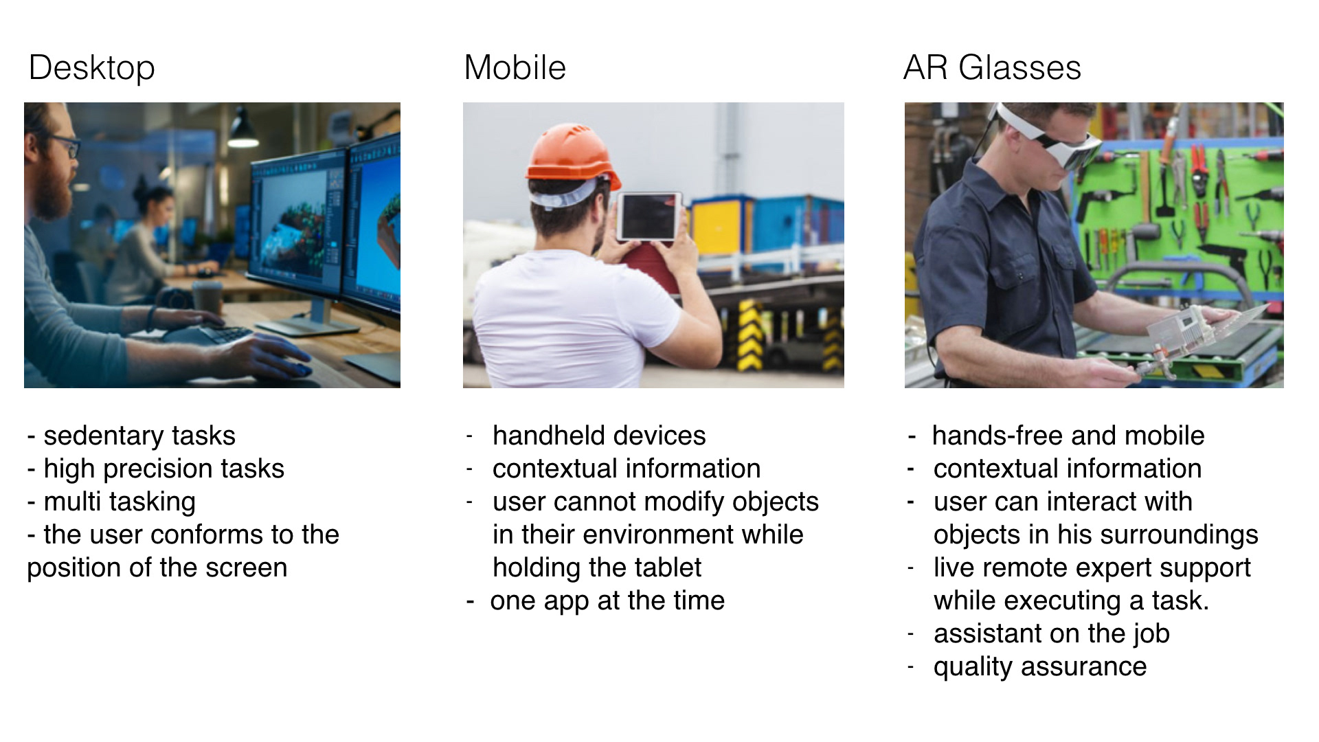
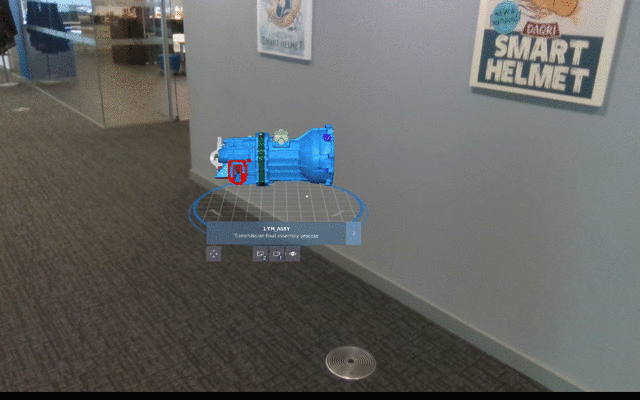
A key differentiator for DAQRI's is that workers don’t have to use their hands to interact with our AR content. To enable this we designed and build the most advanced AR Operating system and application suite that uses the reticle as its main input. To my relief customers find it actually pretty intuitive.
What's the difference?
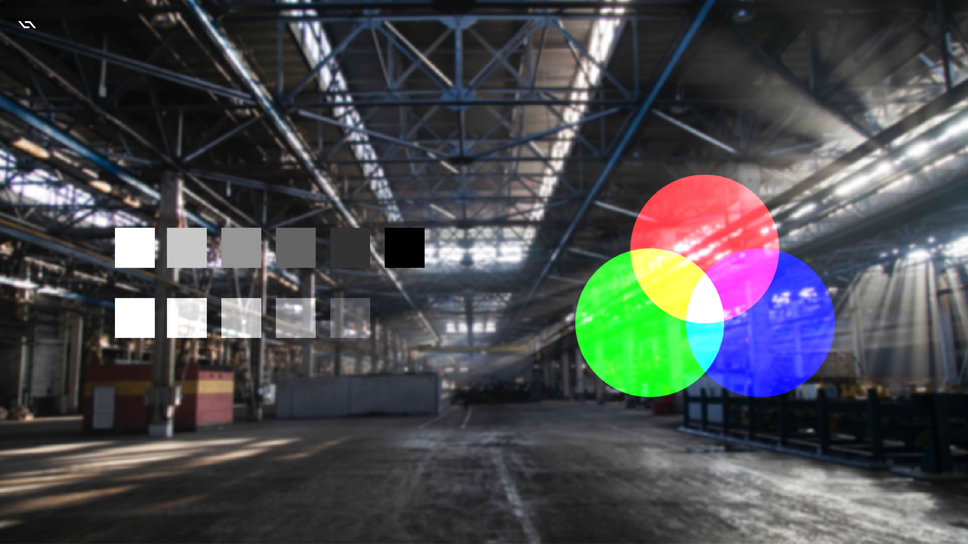
Additive Light
There are a number of challenges when designing for AR one of them is that our lenses add light to the light from the real world. This type of additive color mixing means that the color black is fully transparent where white should only be used sparingly as it occludes the environment from the user and can be compared to looking into a bright light.
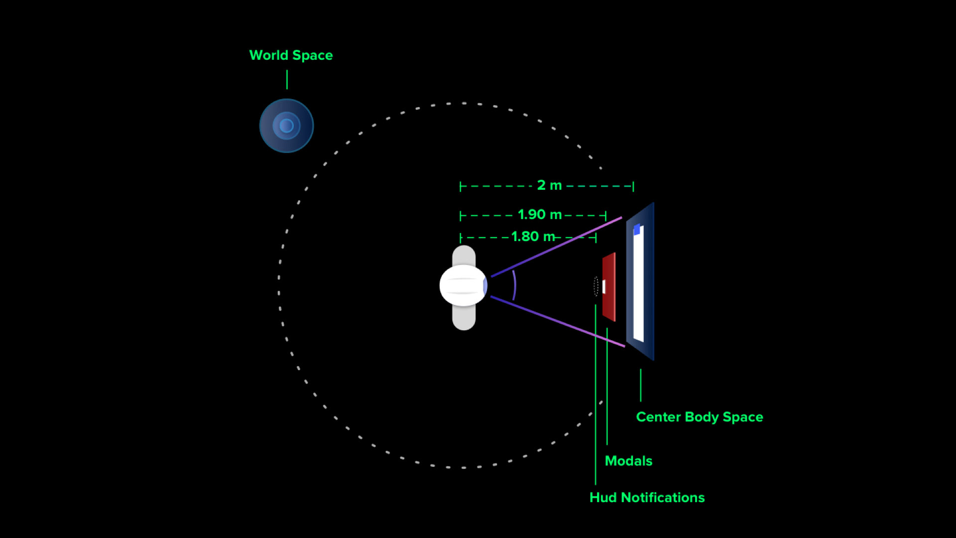
Content Spaces
We have the option of placing UI content anywhere around the user in the 3D environment. But virtual objects should generally be placed between 0.5m and 5m from the user. Placing content closer than that can causes eye strain and if virtual content is placed farther than that, we stop perceiving stereo separation and the environment gets messy .
3D Interface
With our high definition stereo vision glasses, the user perceives dimensions and distances of virtual objects with high precision.
We use this to emphasise interaction.
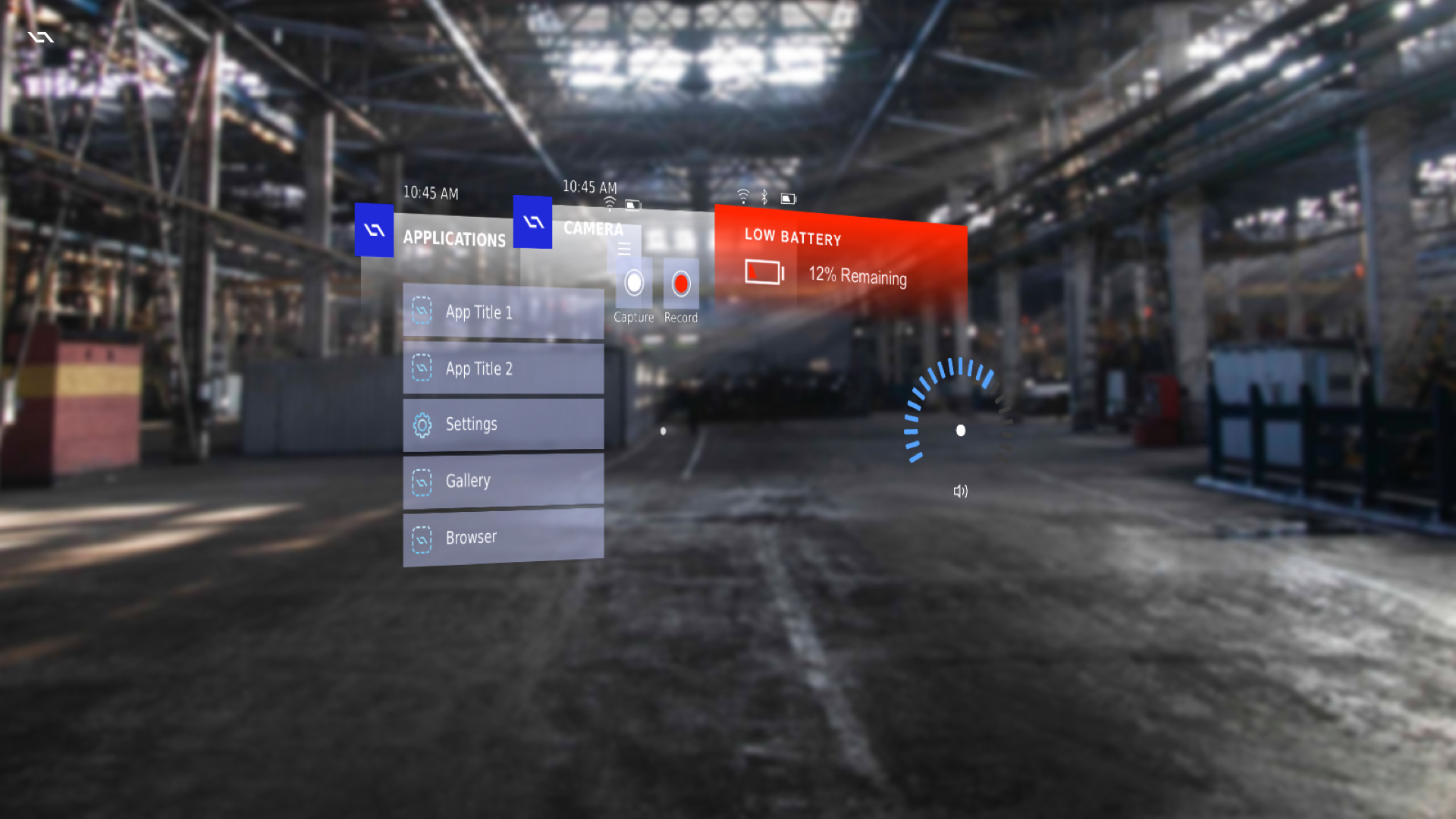
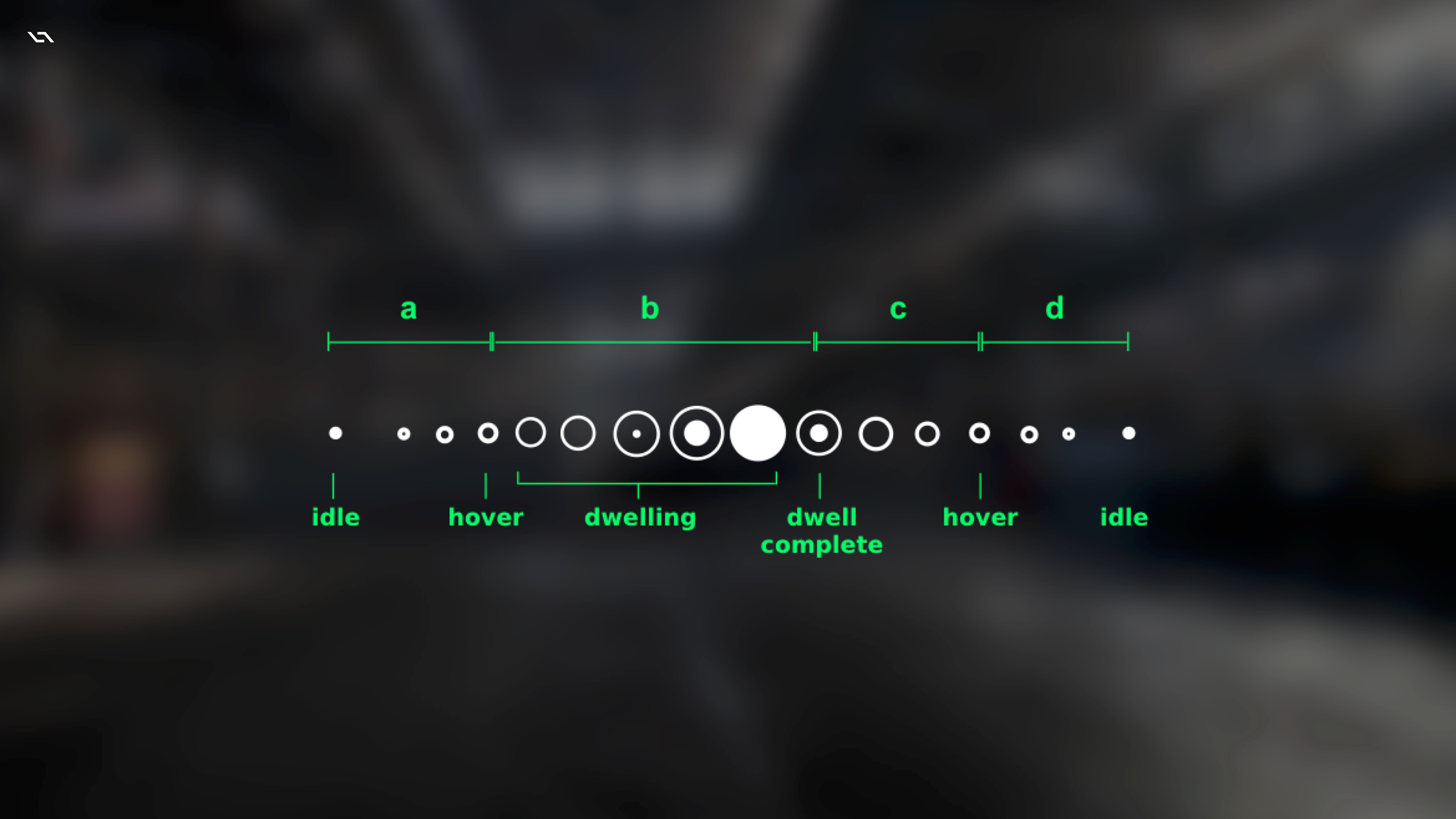
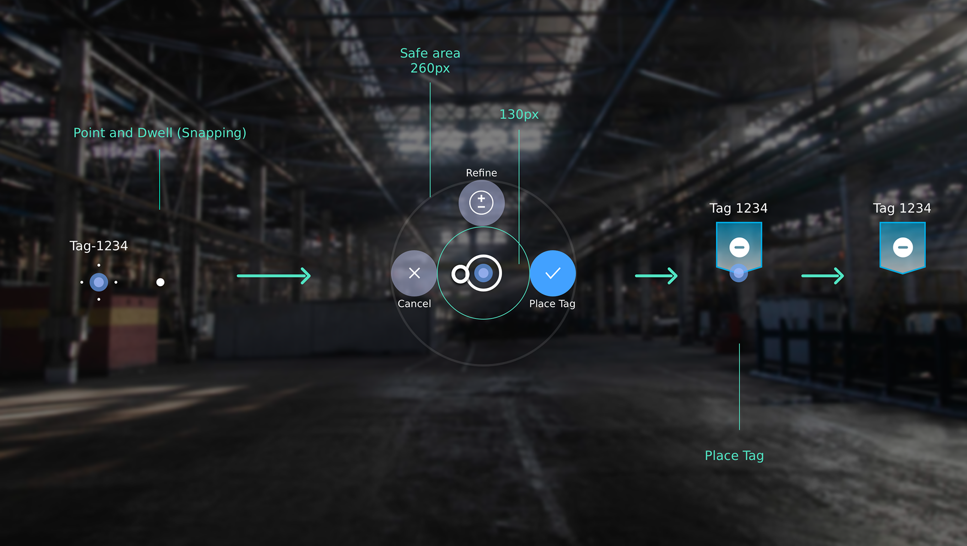
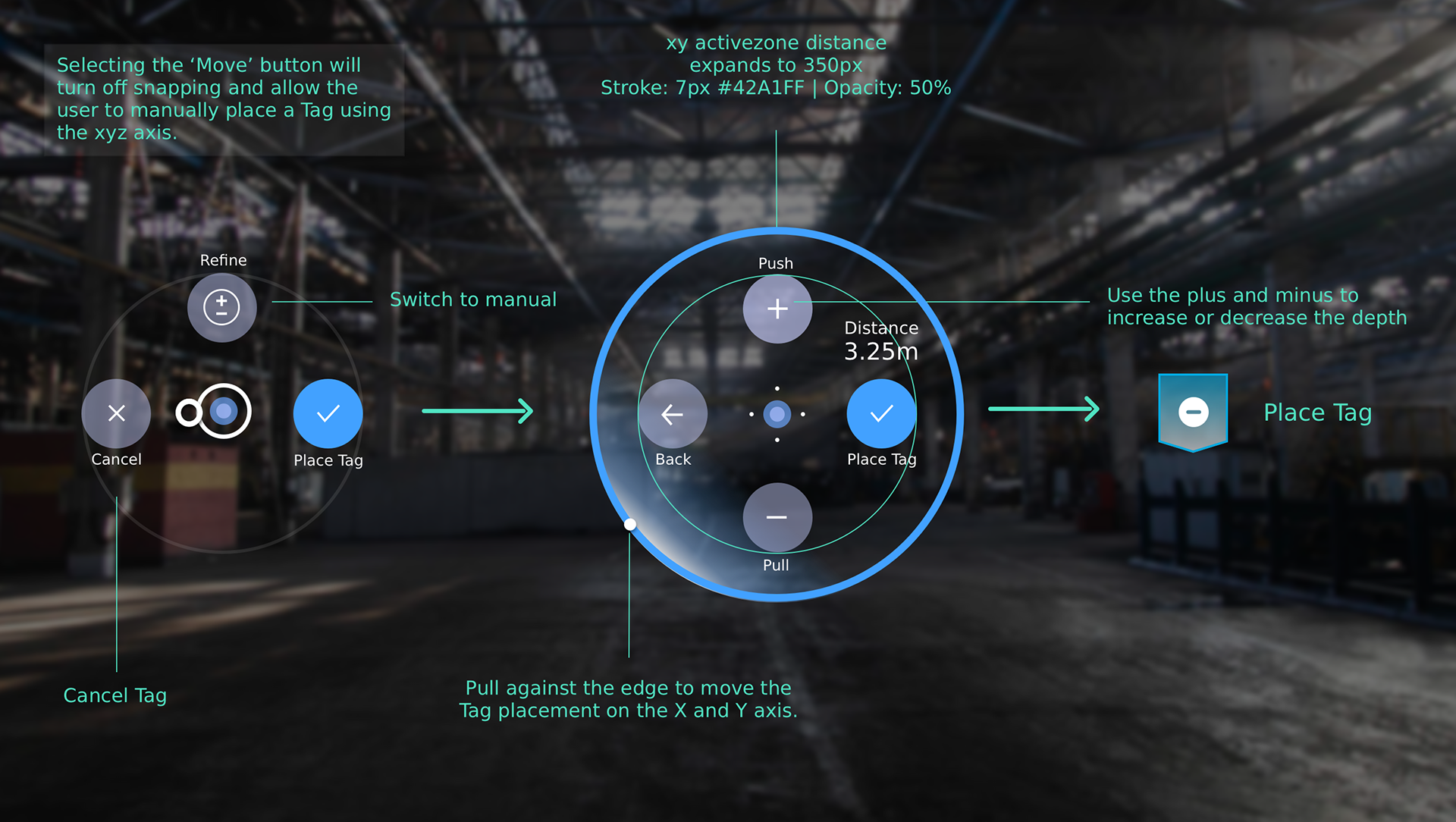
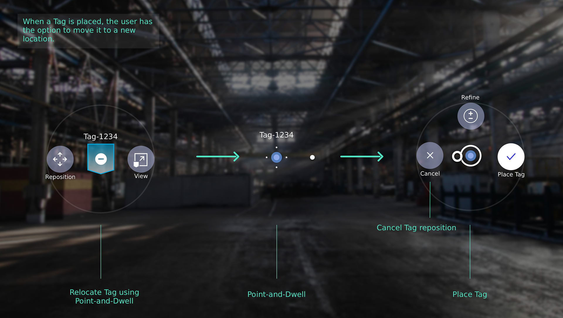
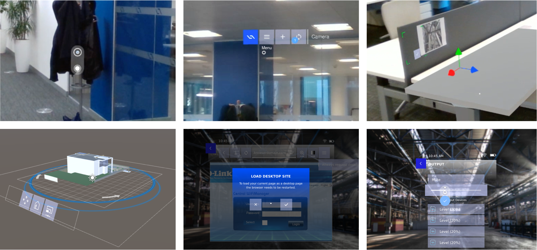
The Reticle
Across DAQRI's operating system the reticle is the primary navigation tool, or pointer, for navigating and selecting items within the AR experience. The reticle remains just above the center point of your view.
The reticle has three states and animated between them: Idle, Hover, Dwell Complete
Dwellable Prototypes
Designing for Web and mobile is "easy". We have countless tools that help us design and test our concepts. When I started design for AR in 2016 the whole field was pretty much in its infancy at it was mainly those that worked at one of the few AR Wearable companies than manufactured hardware, that could start exploring in the much hyped and novel medium.To enable everyone in the design team to start exploring and to facilitate a fast iterative design process, I developed a prototyping too that allowed designers to go from Sketch to AR without having to code. Later iterations of this tool allowed designers to export from Sketch to the Dwellable Viewer App directly.
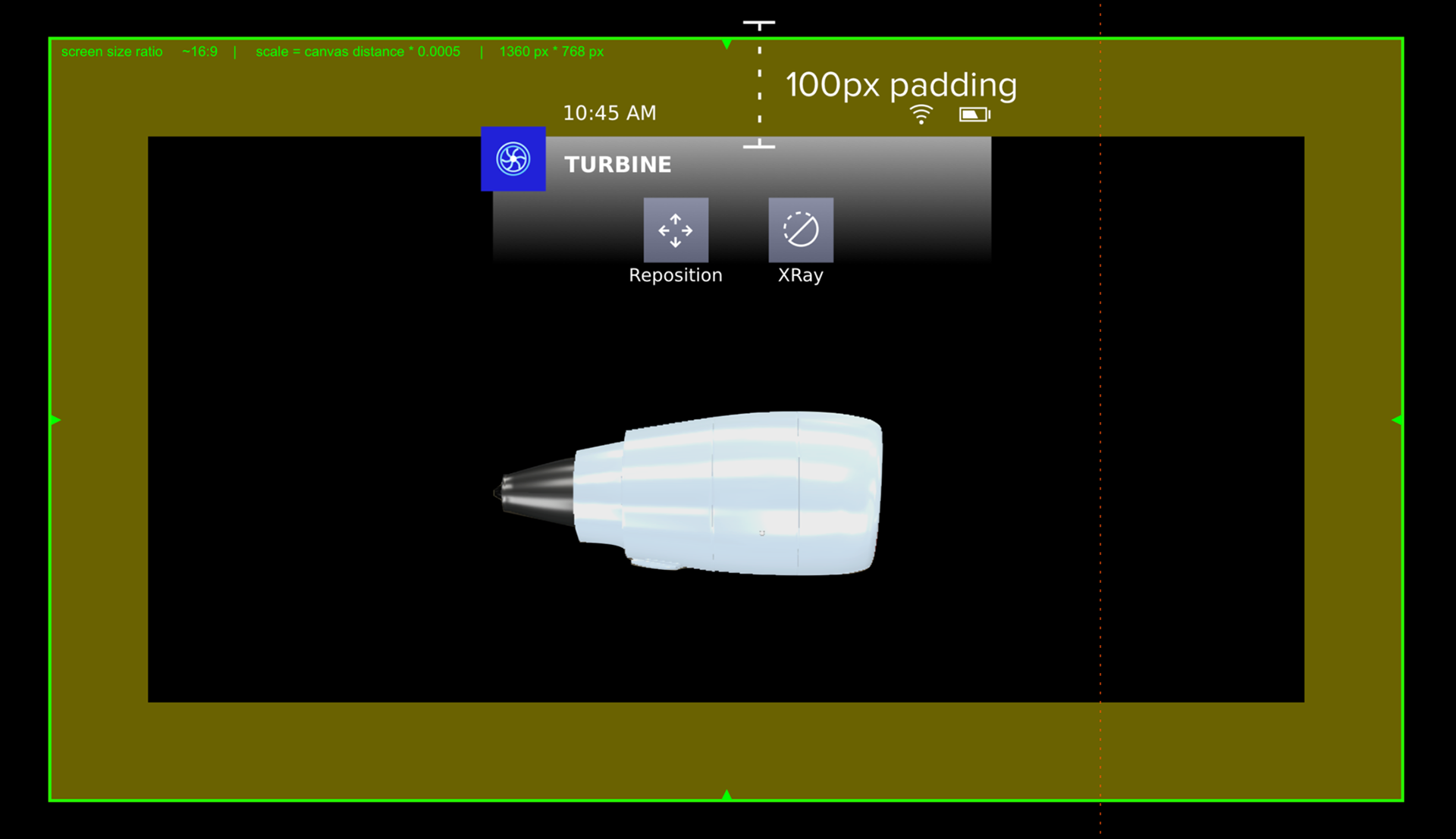
Creating Implementation Specs for AR
When you design for 3D Environments, measuring in pixels does not work. So we have to communicate UI dimensions with the engineers in mm. Our navigation button for example is 65 mm high and wide and is placed at 2 meter distance from the user. We have developed standards that allow us to translate dimensions from 2D designs to 3D game environments.
• 1360 px * 768 px at distance of 2m at scale 0.001
• screen size ratio = ~16:9
• scale = canvas distance * 0.0005
• In this configuration, Sketch App Dimensions can be used 1:1 in Unity.
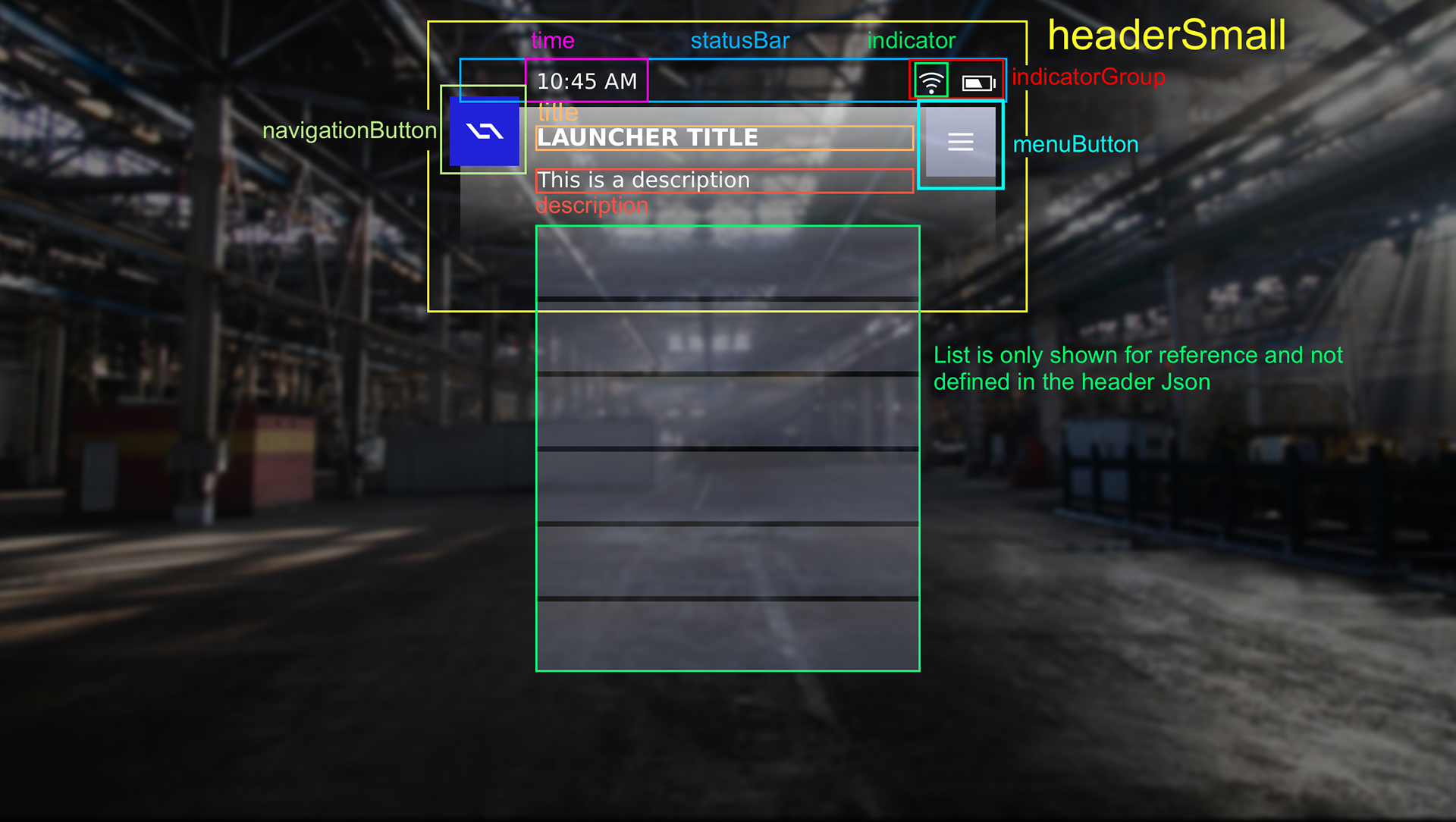
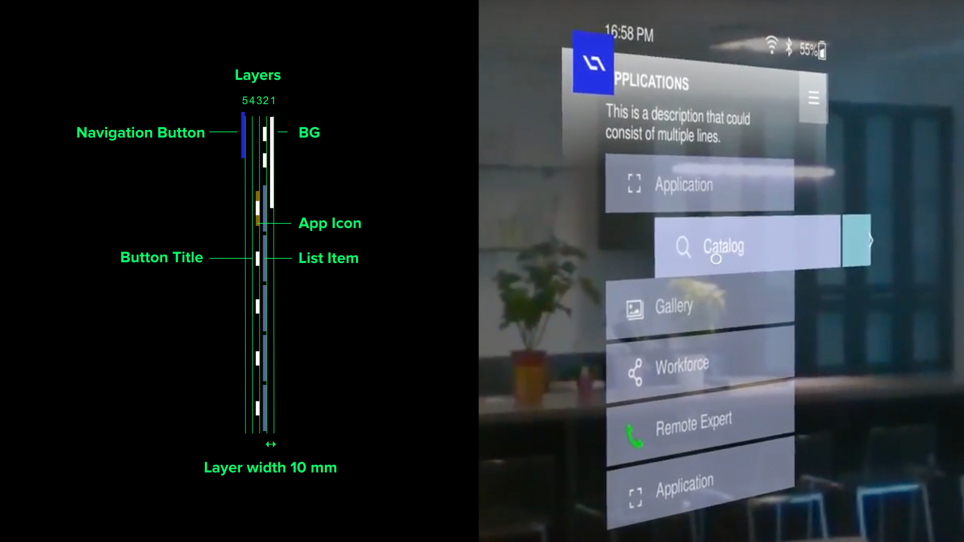
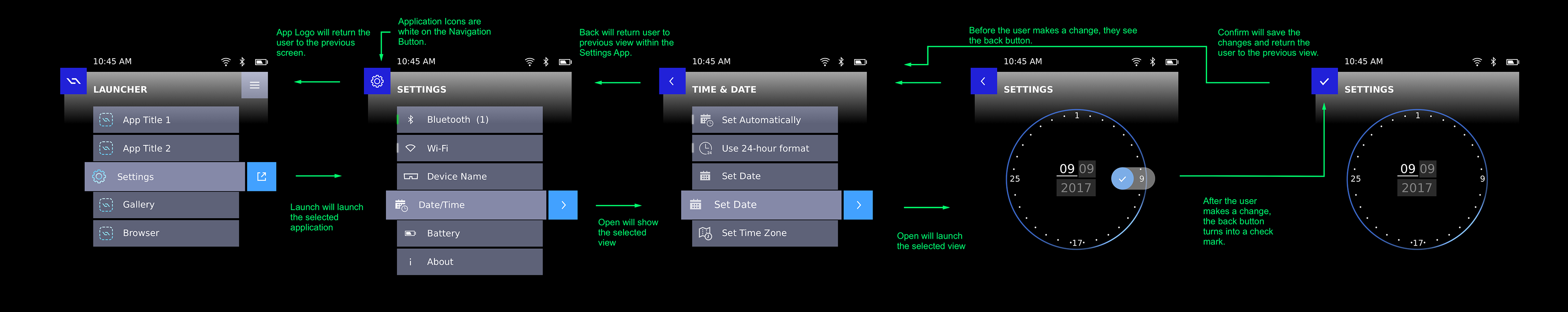
App Hierarchy
I believe that learnability followed consistency is key in order to succeed with new users. The following diagram shows the navigation pattern that is followed by all DAQRI's applications.
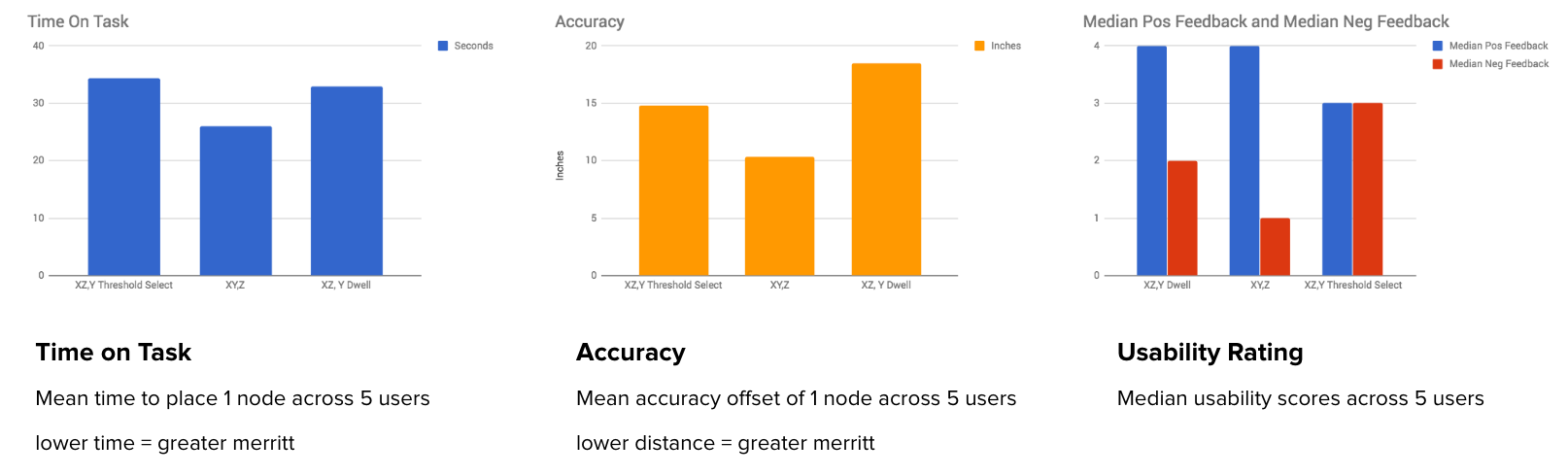
User testing results
To determine what placement method is most accurate, least time consuming and most liked by users we prototyped 3 different approaches. We commonly test for the following KPI's
• Time-on-task
• Completion rate
• System Usability Scale (usability, learnability)
• Fatigue ratings
• Head movement data
• Accuracy (depending on target task(s))
Extensive testing and iterating allowed us to create a tool that performed best in all areas of testing both in the qualitative and quantitive testing results as seen in the graphs below.
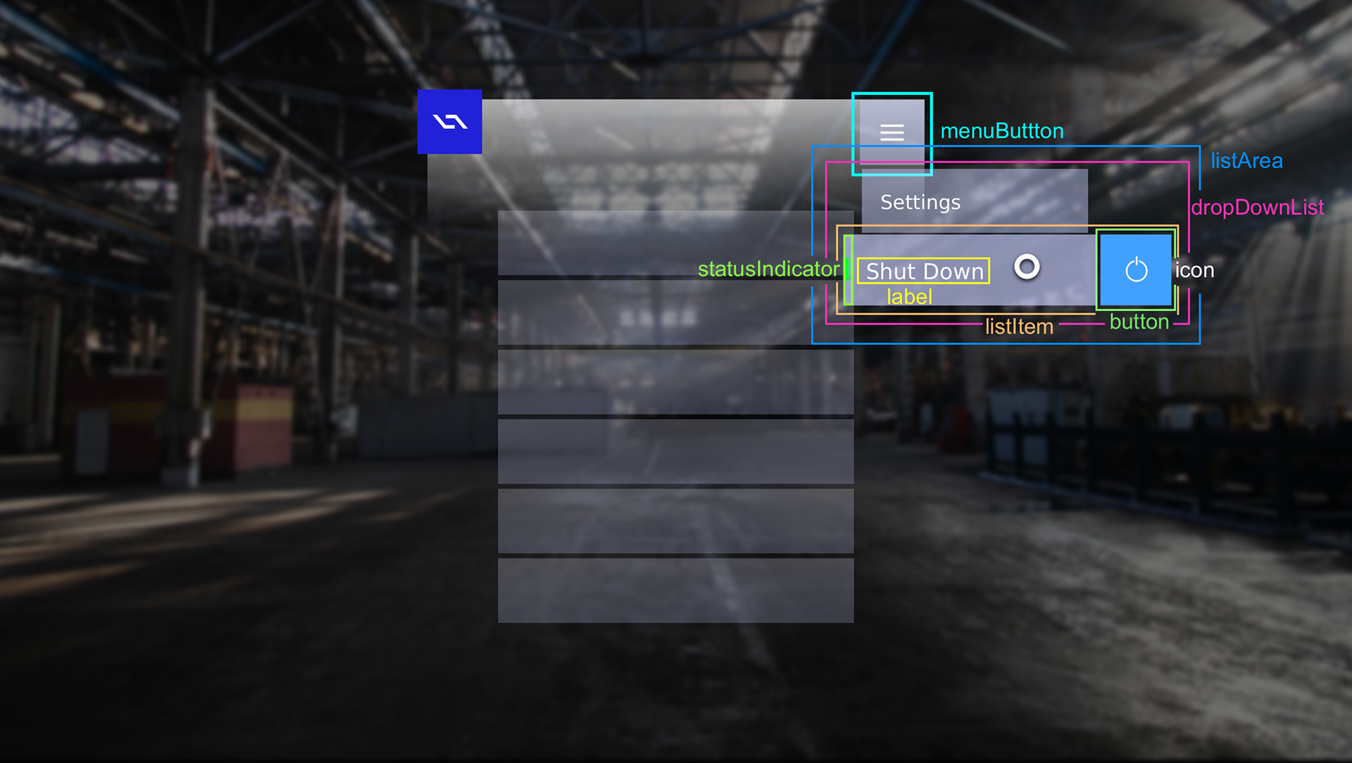
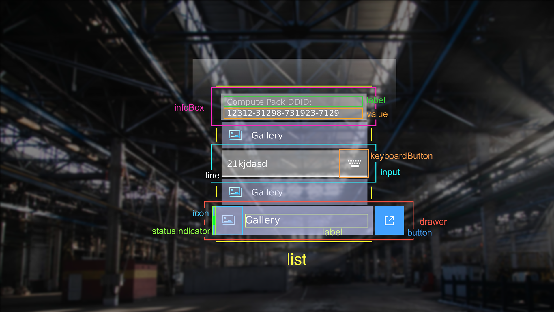
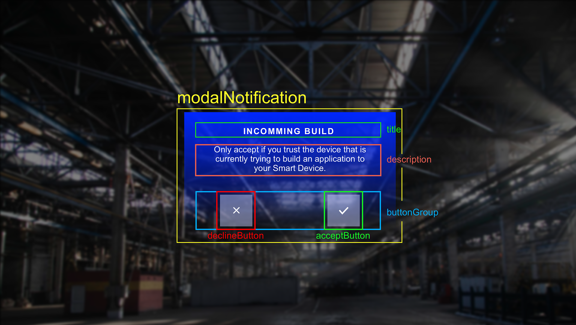
The placement component is one of many UI components that I have designed, prototyped and user tested. All of these components now define the UX foundation that is regularly praised by our customers .
Mixing 2D and 3D
The Worksense Suite